
แอปส่วนใหญ่นั้นจะมีระบบ Sign In ที่ผู้ใช้จะต้องผ่านการ Authentication ก่อนใช้งาน และการใช้รหัสผ่านก็เป็นหนึ่งในวิธียอดนิยม และในการออกแบบ UI ก็มักจะออกแบบมาให้ช่องกรอกรหัสผ่านนั้นซ่อนตัวอักษรที่ผู้ใช้พิมพ์ลงไป เพื่อไม่ให้คนอื่นเห็นได้ง่าย
สำหรับแอปบางตัวก็อาจจะต้องการเพิ่มปุ่มไว้ข้างๆช่องกรอกรหัสผ่าน เพื่อให้ผู้ใช้สามารถกดเปิด/ปิดการซ่อนรหัสผ่านได้ จะได้สามารถตรวจสอบได้ว่ากรอกรหัสผ่านถูกต้องแล้วจริงๆ ซึ่งจะเป็นลักษณะของการ Opt-out (กดเพื่อแสดงรหัสผ่าน)
โดยปกติแล้วนักพัฒนาก็จะต้องเขียนคำสั่งต่างๆเพื่อควบคุมการทำงานนี้ทั้งหมด แต่รู้มั้ยว่าจริงๆแล้ว นักพัฒนาสามารถใช้ Material Design Components ที่ชื่อว่า TextInputLayout และ TextInputEditText ได้เลยนะ ไม่ต้องเขียนคำสั่งเองให้ยุ่งยาก

นอกจาก Material Design จะช่วยให้งานออกแบบนั้นเป็นเรื่องง่ายแล้ว ก็ยังอำนวยความสะดวกให้กับนักพัฒนาเหมือนกัน เพราะว่า Material Design ก็ได้มี Library ที่เรียกว่า Material Design Components เพื่อให้นักพัฒนาสามารถนำไปใช้งานได้ตรงกับ Principle ของ Material Design อีกทั้งยังยืดหยุ่นในการปรับแต่งให้ตรงกับความต้องการมากขึ้น
ในการใช้งาน TextInputLayout และ TextInputEditText อย่าลืมเพิ่ม Dependency ของ Material Design Components เข้าไปในโปรเจคก่อน
implementation 'com.google.android.material:material:<latest_version>'สำหรับการใช้งานใน Layout Resource ให้ใช้ TextInputEditText แทน EditText ได้เลย แต่ต้องถูกครอบด้วย TextInputLayout เสมอ
<com.google.android.material.textfield.TextInputLayout
    android:layout_width="wrap_content"
    android:layout_height="wrap_content">

    <com.google.android.material.textfield.TextInputEditText
        android:layout_width="wrap_content"
        android:layout_height="wrap_content"/>

</com.google.android.material.textfield.TextInputLayout>
และเนื่องจากต้องการให้ปุ่มที่อยู่ด้านหลังเป็นปุ่มเปิด/ปิดการซ่อนรหัสผ่าน ก็จะต้องกำหนดค่า app:endIconMode ใน TextInputLayout ให้เป็น password_toggle
<com.google.android.material.textfield.TextInputLayout
    ...
    app:endIconMode="password_toggle">

    <!-- TextIntputEditText -->

</com.google.android.material.textfield.TextInputLayout>
เจ้าของบล็อกใช้ app เป็น Namespace สำหรับ Custom Attribute ใดๆโดยภาพ Default ของปุ่มดังกล่าวจะมีหน้าตาเป็นแบบนี้

เปลี่ยนภาพของปุ่ม
ถ้าหากไม่ชอบภาพ Default ที่ Library กำหนดไว้ให้ ก็สามารถเปลี่ยนได้ตามใจชอบ โดยให้กำหนด Attribute ที่ชื่อว่า app:endIconDrawable เพิ่มเข้าไป พร้อมกับ Drawable ที่ต้องการ โดยมีเงื่อนไขว่า Drawable นั้นๆจะต้องเป็น State List Drawable (Selector Drawable)
<!-- res/drawable/ic_password_visibility.xml -->
<?xml version="1.0" encoding="utf-8"?>
<selector xmlns:android="http://schemas.android.com/apk/res/android">
    <item android:drawable="@drawable/ic_password_visibility_off" android:state_checked="false" />
    <item android:drawable="@drawable/ic_password_visibility_on" />
</selector>
และขนาดของภาพไอคอนจะไม่สามารถกำหนดเองได้ ดังนั้นนักพัฒนาจะต้องเตรียมภาพที่มีขนาดที่เหมาะสมมาใช้ตั้งแต่แรก โดยจะต้องเป็นภาพไอคอนที่มีขนาด 24 x 24 dp
ถ้าใช้เป็น Vector Drawble ก็ไม่มีปัญหาอะไร กำหนดขนาดภาพเป็น 24 x 24 dp ได้เลย แต่ถ้าเป็น Bitmap Drawable ก็ให้เตรียมภาพหลายๆขนาดตาม DPI ของหน้าจอแทน

จากนั้นก็เอา State List Drawable ตัวนั้นไปกำหนดไว้ใน app:endIconDrawable ได้เลย
<com.google.android.material.textfield.TextInputLayout
    ...
    app:endIconDrawable="@drawable/ic_password_visibility">

    <!-- TextIntputEditText -->

</com.google.android.material.textfield.TextInputLayout>
เปลี่ยนสีของปุ่ม
ถ้าอยากเปลี่ยนสีก็ให้กำหนด app:endIconTint เข้าไป
<com.google.android.material.textfield.TextInputLayout
    ...
    app:endIconTint="@color/teal_200">

    <!-- TextIntputEditText -->

</com.google.android.material.textfield.TextInputLayout>
การกำหนด Style ของ TextInputLayout
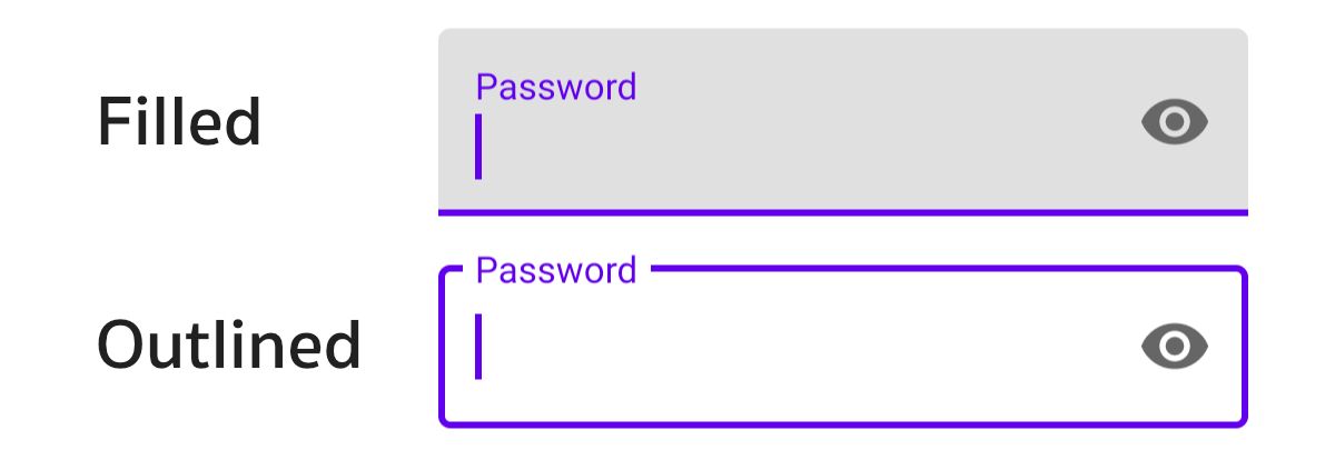
สำหรับ TextInputLayout จะมี Style อยู่ 2 แบบด้วยกันคือ Filled กับ Outlined
นักพัฒนาสามารถกำหนด Style ที่ต้องการด้วย style ได้เลย
<com.google.android.material.textfield.TextInputLayout
    ...
    style="@style/Widget.MaterialComponents.TextInputLayout.FilledBox">

    <!-- TextIntputEditText -->

</com.google.android.material.textfield.TextInputLayout>- Filled :
@style/Widget.MaterialComponents.TextInputLayout.FilledBox - Outlined :
@style/Widget.MaterialComponents.TextInputLayout.OutlinedBox
แต่ถ้าต้องการ Style ที่มีหน้าตาแบบนี้

ก็ให้กำหนด Style เป็นแบบ Filled แล้วกำหนดสีพื้นหลังให้เป็น Transparent แทน
<com.google.android.material.textfield.TextInputLayout
    ...
    style="@style/Widget.MaterialComponents.TextInputLayout.FilledBox"
    app:boxBackgroundColor="#00000000">

    <!-- TextIntputEditText -->

</com.google.android.material.textfield.TextInputLayout>
เพียงเท่านี้ก็ได้ EditText สำหรับช่องกรอกรหัสผ่านที่มีปุ่มเปิด/ปิดการซ่อนรหัสผ่านแล้ว จะเห็นว่าขั้นตอนทั้งหมดนี้ไม่จำเป็นต้องแตะโค้ด Kotlin เลยซักนิด